
Colour
Colour is endlessly complex — and that complexity feels especially charged for me, as someone who is partially colour blind. I see fewer shades of red and green than most people, which makes painting more interesting. There are so many aspects of colour to consider when painting: value, saturation, complements, temperature, and harmony, to name just a few. Balancing all of these while also thinking about composition, texture, and mark-making can feel like juggling several conversations at once. It takes time and practice to develop an instinct for how colour behaves within a painting.
This week, I found inspiration in the work and words of Brian Rutenberg. His reflections on colour, particularly in his book Clear Seeing Place and in his Studio Visits videos on YouTube, encouraged me to think more intentionally about how colours interact and why certain combinations hold our attention.
Rutenberg speaks about specific colour pairings and contrasting hues that invite the viewer to pause and linger. According to him, these combinations can “arrest” the viewer’s gaze, creating a moment of stillness in which subtle shifts in colour, marks, and shapes become more noticeable.
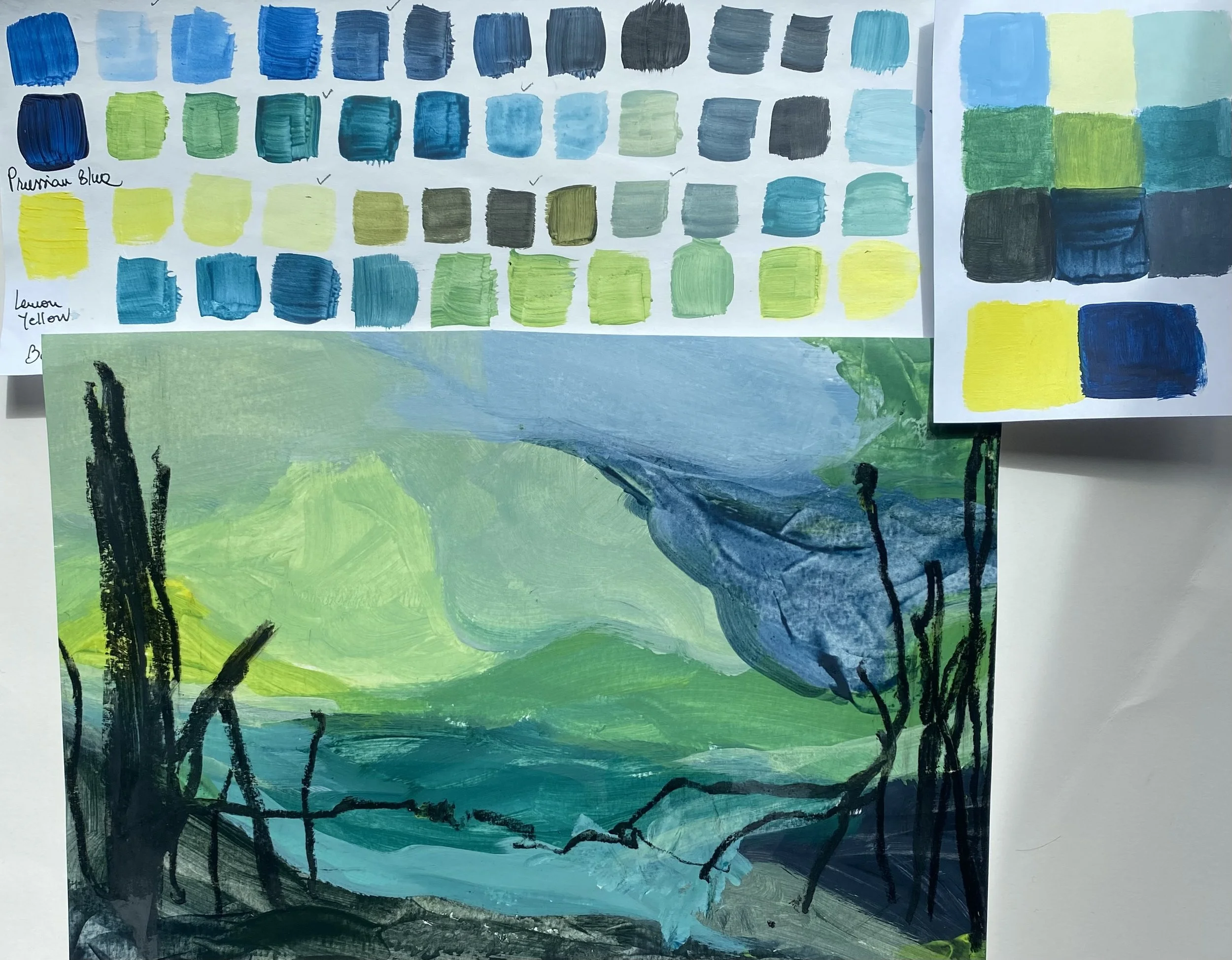
Some of his favourite combinations include teal and orange, bright purple and permanent green, and red and grey. These are combinations I would not naturally reach for, so I decided to experiment with them through a series of small studies on paper and wood board. Alongside these, I also explored one of my own favourite pairings - Prussian blue and lemon yellow (including black and white).
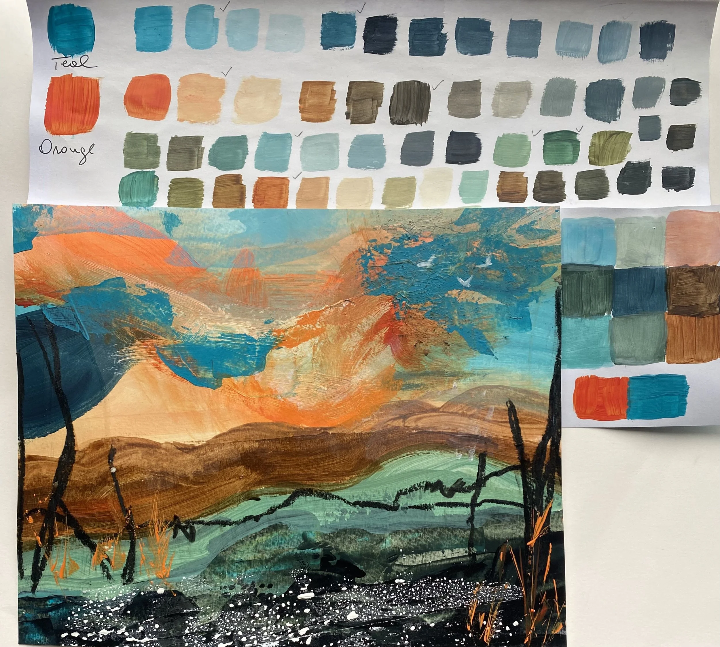
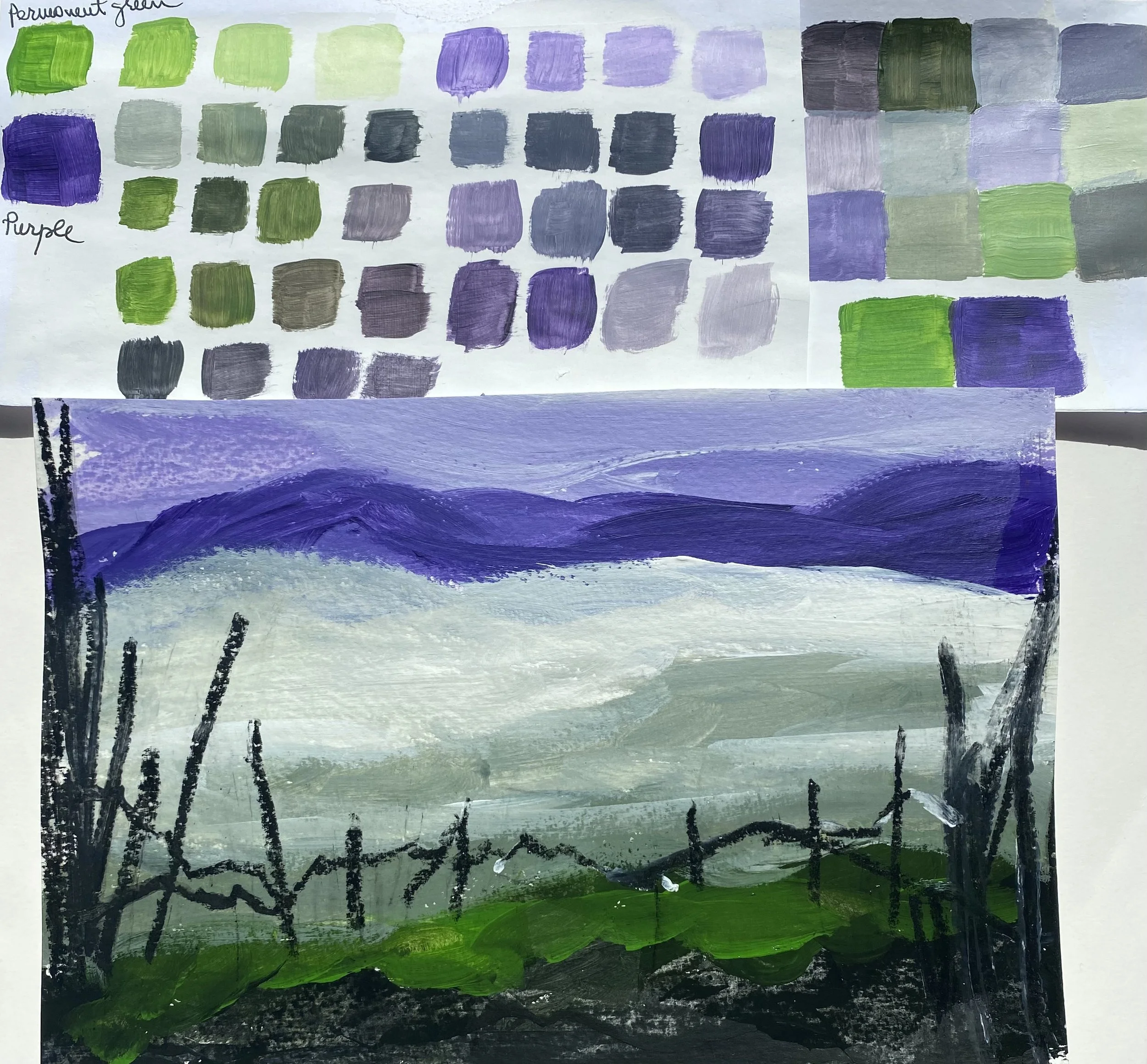
The first stage involved creating colour swatches and selecting preferred values of darks, mid-tones, and lights. One of Rutenberg’s ideas that stayed with me throughout this process was his advice to “start a painting like a bricklayer and finish it like a jeweller.”
I began each composition by blocking in large masses of colour to observe how they interacted and affected one another.
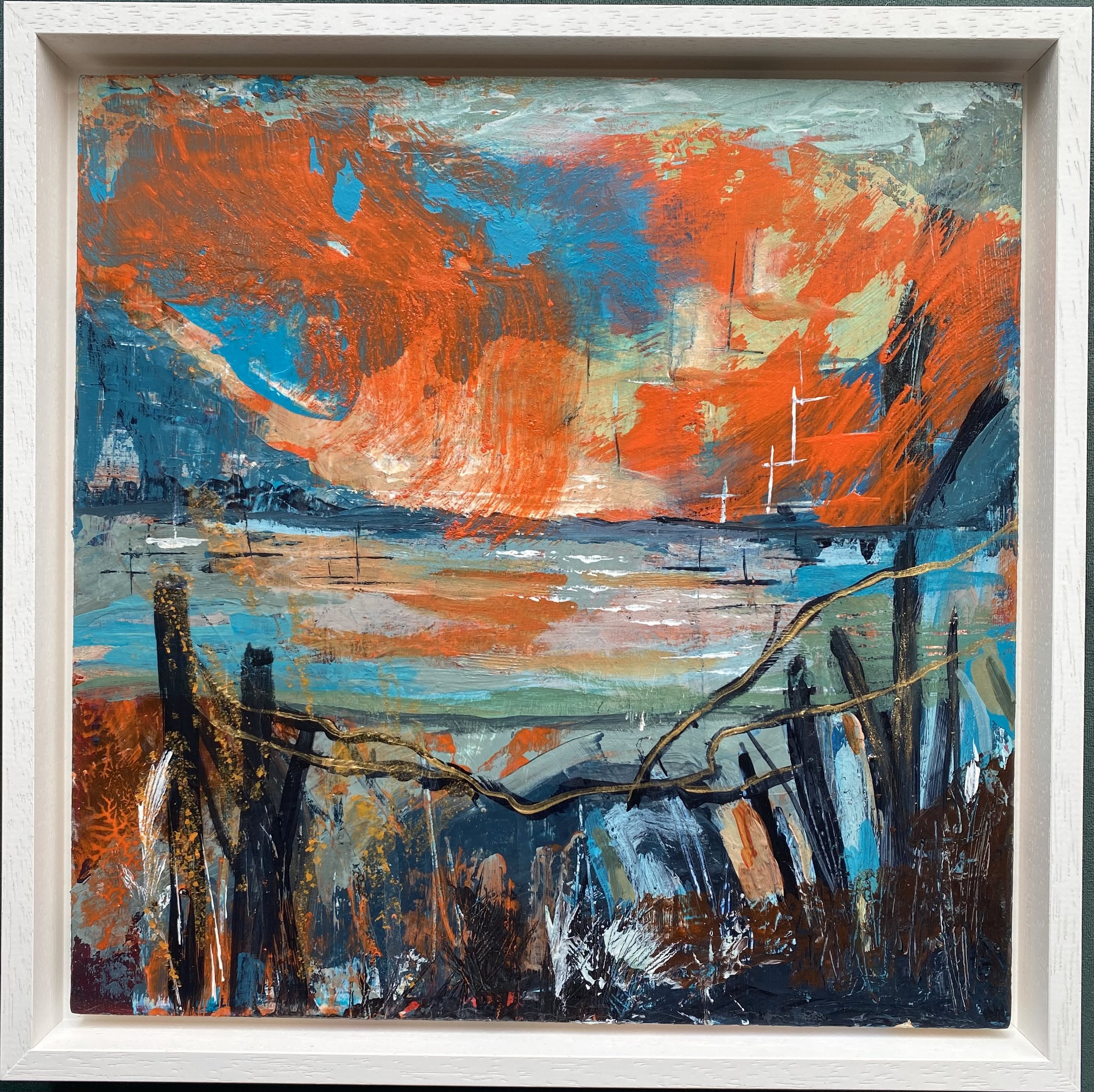
Teal and Orange
The contrast between teal and orange created a strong visual tension. I found that the warmth of the orange seemed to pulse against the cooler teal passages, creating movement and rhythm across the surface. This combination felt energetic and unexpectedly atmospheric.
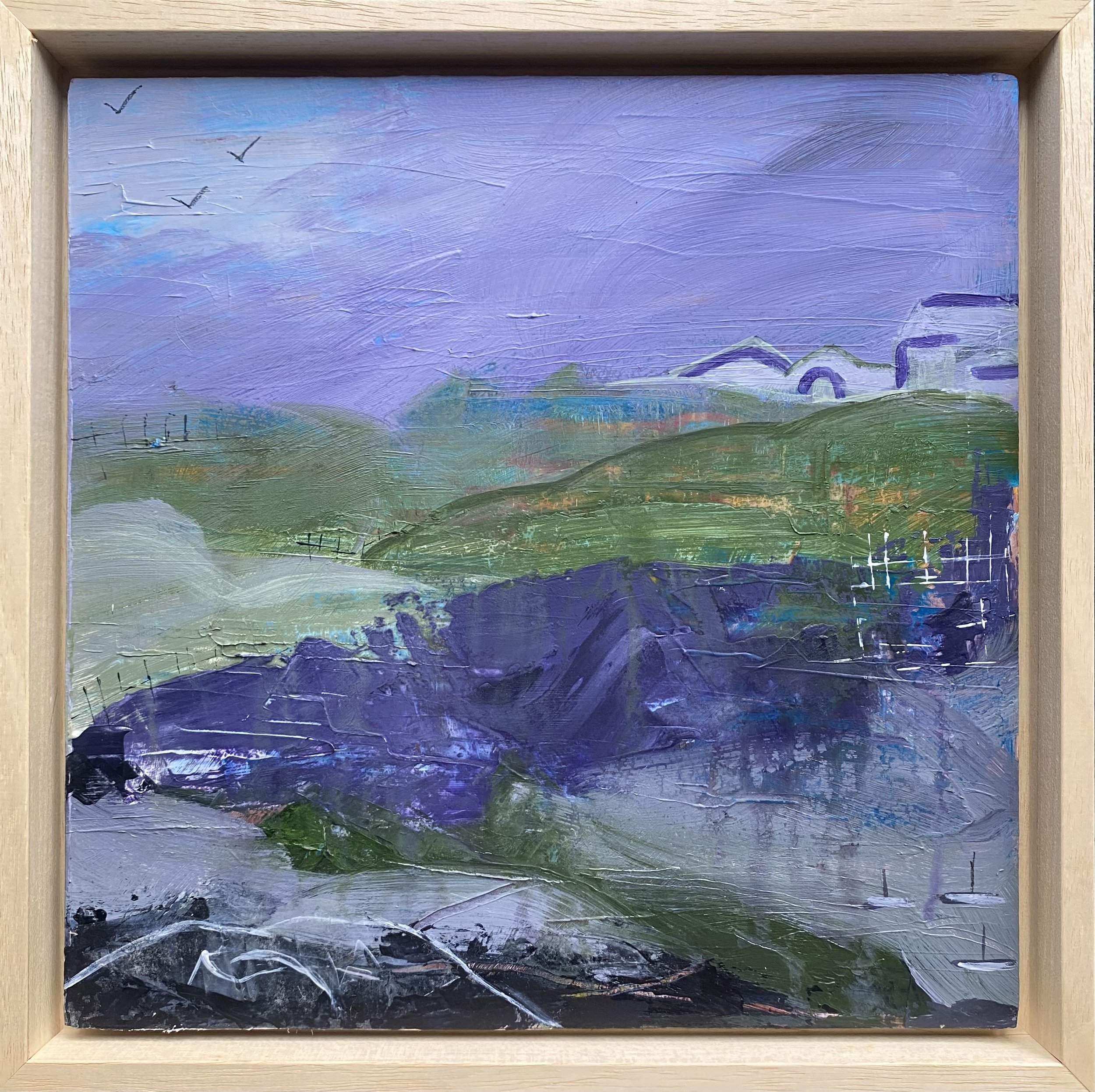
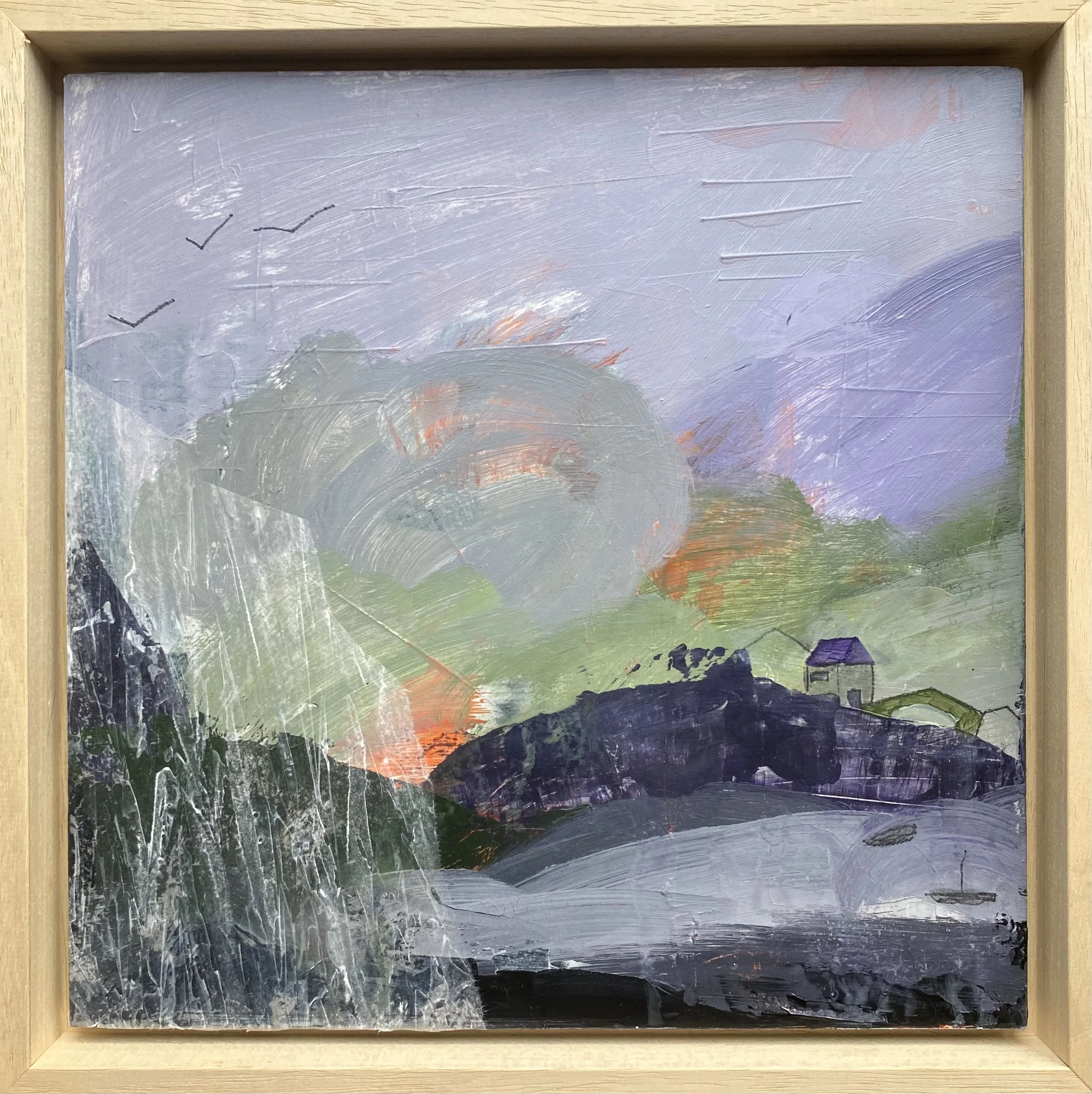
Purple and Permanent Green
This pairing pleasantly surprised me. Purple is not usually a colour I gravitate towards, yet combined with permanent green, it created a moody, atmospheric quality that felt well-suited to the coastal landscape.
In these studies, I kept the upper areas lighter and the lower sections heavier and more grounded. Simple linear marks suggested cottages and houses found along the coastal path. I also experimented with both high and low horizon lines and found that each produced a distinctly different emotional weight.
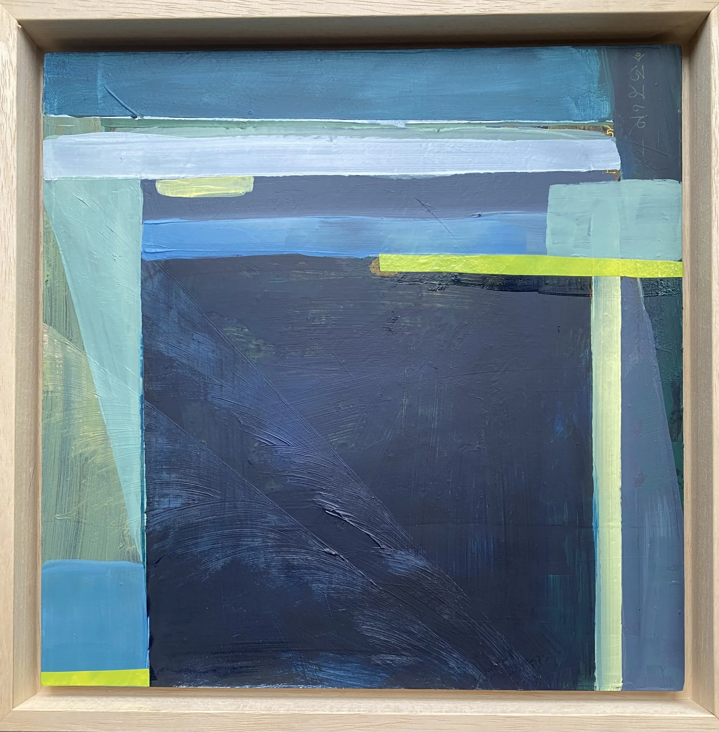
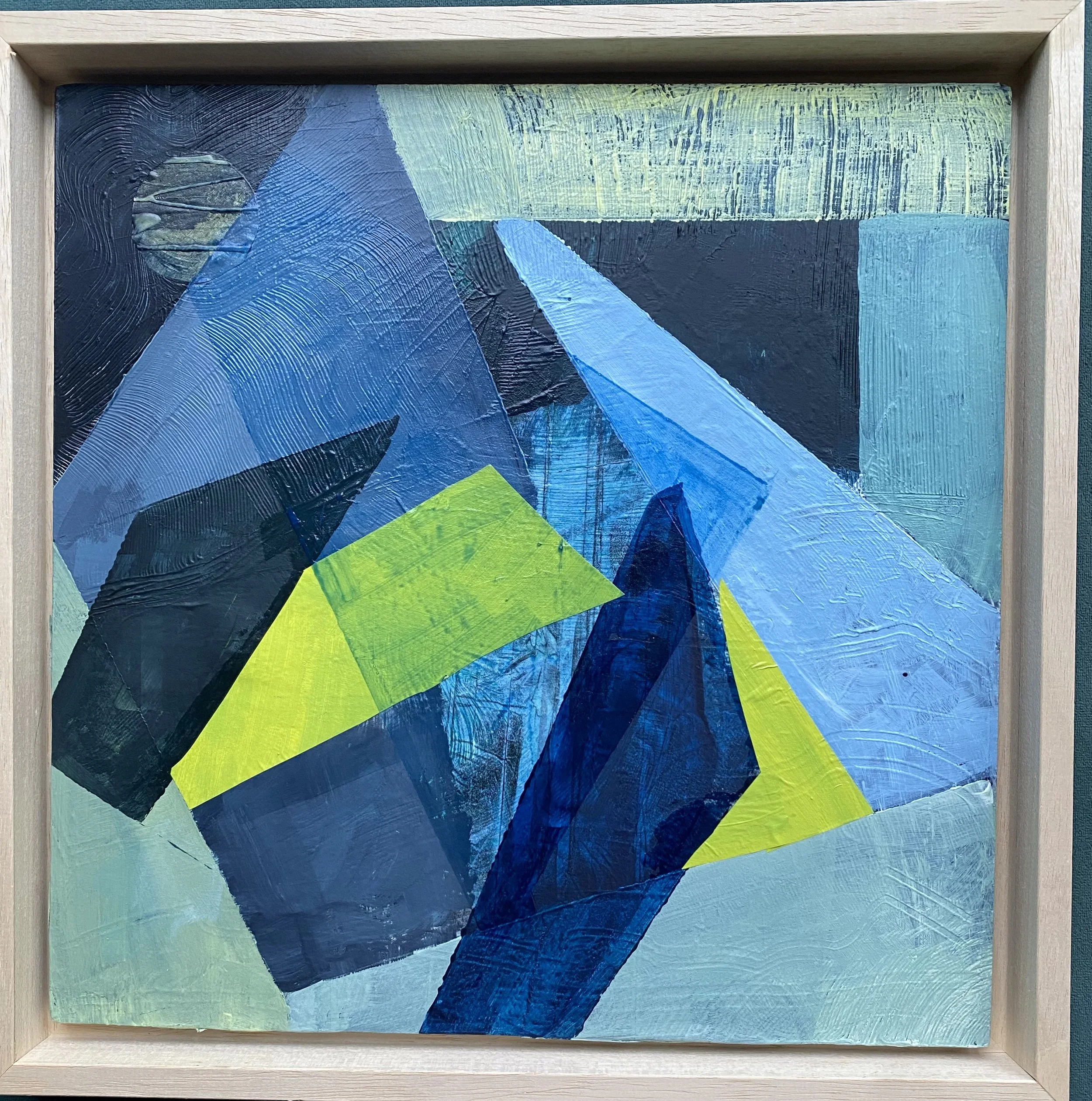
Prussian Blue and Lemon Yellow
This remains one of my favourite colour combinations. There is something deeply satisfying about the intensity of Prussian blue against the brightness of lemon yellow.
Here I moved away from organic, landscape-oriented forms and into something more geometric — influenced by Karen Schults and Richard Diebenkorn. The angular divisions and stripped-back shapes pushed the composition toward a satisfying flatness, where nothing competes for attention except the colours themselves.
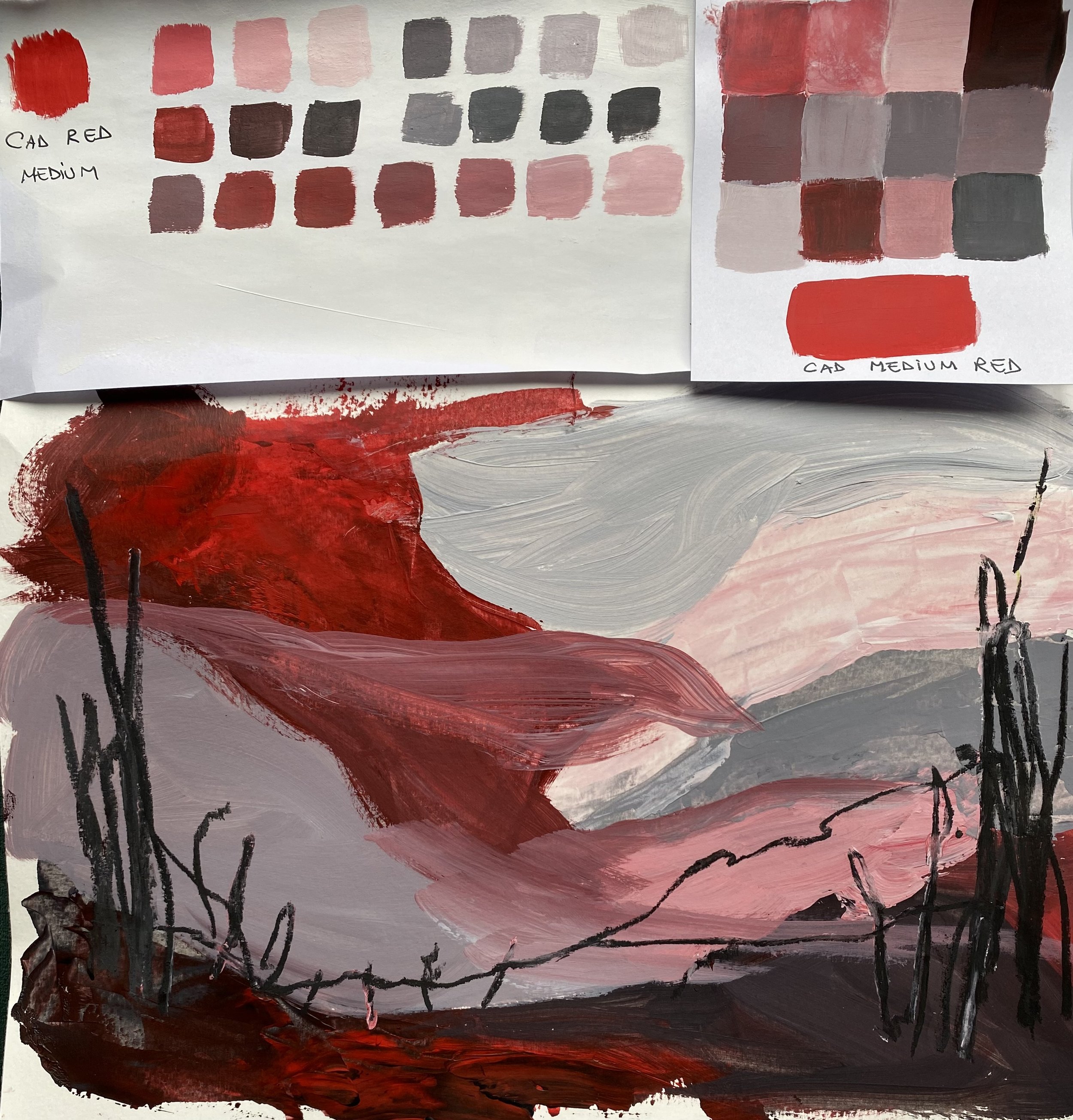
Red and Grey
For the final study, I returned to simple blocks of colour arranged within a low-horizon landscape composition. The forms loosely suggested cloud formations and shifting weather patterns.
Although I enjoyed aspects of the process, this combination was probably my least favourite. I prefer the tension of yellow and grey — a pairing often used so beautifully by Joan Eardley in her dramatic Scottish landscapes.
Reflections
These studies feel like planting seeds for future paintings. Each mark suggests another response; each layer opens the possibility for another.
Over the next few weeks, I plan to continue exploring colour alongside texture, particularly through works on paper, and to investigate how these experiments connect back to the coastal environment that continues to inspire my practice.